What is data visualization?
Data visualization refers to the process (and result) of representing data graphically.
For our purposes today, we'll be talking mostly about common methods of plotting data, including:
- Histograms
- Scatterplots
- Line plots
- Bar plots
Why is data visualization important?
Exploratory data analysis
- Checking assumptions: does my data look like how I expect it to look?
- Generating hypotheses: what relationships can I discover in the data?
Communicating insights
- Communicating information clearly, concisely, and accurately.
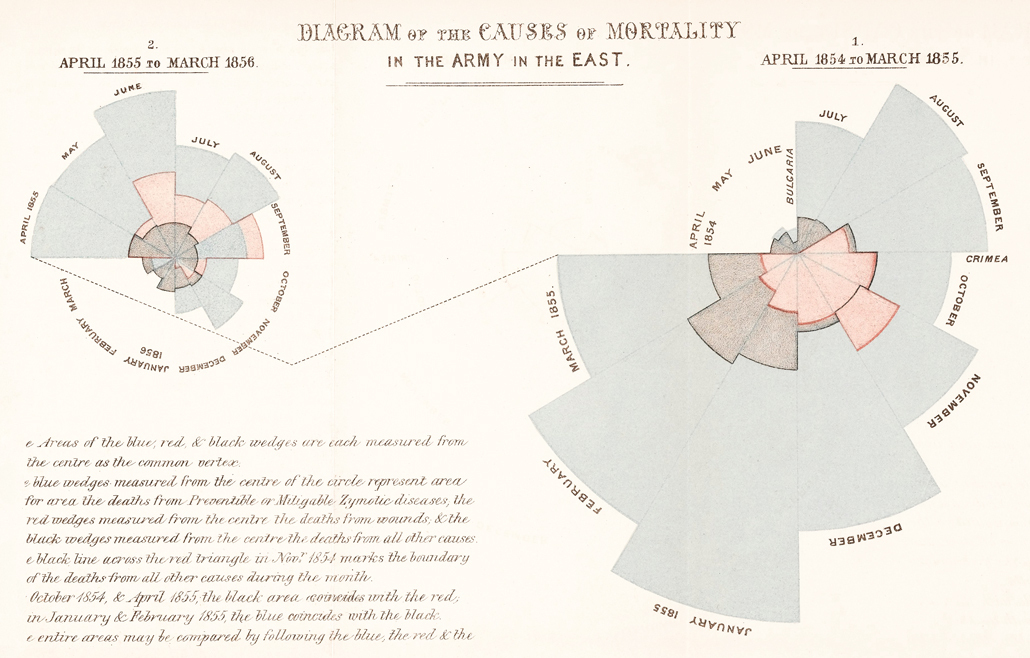
Impacting the world
- Data visualizations can (and have) played a big role in shaping policy, business decisions, and more.
Impacting the world
Florence Nightingale (1820-1910) was a social reformer, statistician, and founder of modern nursing.
So how do we visualize data?
In today's tutorial, we'll discuss how to visualize data using Python.
Key learning outcomes
- Describe the benefits and advantages of data visualization.
- Propose a suitable data visualization for a particular dataset and question.
- Implement a first-draft of this visualization in Python, using either
matplotliborseaborn. - Evaluate this data visualization and make suggestions for improvements in future iterations.
- Reconstruct a visualization found "in the wild" using the appropriate dataset.
Loading packages
Here, we load the core packages we'll be using:
pandas: a library for loading, reshaping, and joiningDataFrameobjects.matplotlib: Python's core plotting/graphics library.seaborn: a library built on top ofmatplotlib, which makes certain plotting functions easier.
We also add some lines of code that make sure our visualizations will plot "inline" with our code, and that they'll have nice, crisp quality.
import pandas as pd # conventionalized abbreviation
import matplotlib.pyplot as plt # conventionalized abbreviation
import seaborn as sns # conventionalized abbreviation
%matplotlib inline
%config InlineBackend.figure_format = 'retina'
Part 1: Basic plot types with matplotlib.pyplot
In this section, we'll explore several basic plot types, first using matplotlib.pyplot. These will include:
- Histograms
- Scatterplots
- Barplots
Afterwards (in Part 2), we will discuss how to replicate these plot types with seaborn, an API built on top of pyplot.
Load dataset
To get started, we'll load a dataset from seaborn.
## Load taxis dataset
df_taxis = sns.load_dataset("taxis")
len(df_taxis)
## What are the columns/variables in this dataset?
df_taxis.head(5)
Histograms: plotting frequency distributions
Histograms are critical for visualizing how your data distribute.
They are typically used for continuous, quantitative variables. Examples could include: height, income, and temperature.
The pyplot package has a dedicated function for creating histograms, called hist (documentation here).
An example call would look like this:
plt.hist(
    x = [ ... ],
    bins = 10, # set number of bins
    density = False, # indicate whether to draw density plot
    alpha = .7 # indicate shading/transparency of plot
)
Now let's plot some of our variables from the taxis dataset!
## Q: How would you describe the shape of this distribution?

plt.hist(
    x=df_taxis['fare'], # this is the variable we're plotting
    bins=20, # this is the number of bins we want to know
    alpha = .5 # this is our alpha level
)
plt.show()

We can also add axis labels, so it's clear what we're plotting.
plt.hist(
    x=df_taxis['fare'], # this is the variable we're plotting
    bins=20, # this is the number of bins we want to know
    alpha = .5 # this is our alpha level
)
plt.xlabel("Fare ($)")
plt.ylabel("Count")
plt.title("Distribution of Taxi Fares ($)")
plt.show()

Q: How would you plot the distribution of trip distances?
plt.hist(
    x=df_taxis['distance'], # this is the variable we're plotting
    bins=20, # this is the number of bins we want to know
    alpha = .5 # this is our alpha level
)
plt.xlabel("Distance (miles)")
plt.ylabel("Count")
plt.title("Distribution of Trip Distances")
plt.show()

Q: What about the distribution of tip amounts?
plt.hist(
    x=df_taxis['tip'], # this is the variable we're plotting
    bins=20, # this is the number of bins we want to know
    alpha = .5 # this is our alpha level
)
plt.xlabel("Tip ($)")
plt.ylabel("Count")
plt.title("Distribution of Tip Amounts ($)")
plt.show()

Q: What if we wanted to plot the distribution of tip percentages?
Creating a new variable
Presumably, these tip amounts correlate with the overall fare. We might also want to know about the amount in percentage-terms, e.g., how much a customer tipped as a percentage of how much the fare was.
## tip_pct = tip / fare
df_taxis['tip_pct'] = (df_taxis['tip'] / df_taxis['fare']) * 100
Now we can plot this new variable, to get a sense of the distribution of tip percentages.
Q: What conclusions might we draw about the distribution of tip percentages here?
plt.hist(
    x=df_taxis['tip_pct'], # this is the variable we're plotting
    bins=20, # this is the number of bins we want to know
    alpha = .5 # this is our alpha level
)
plt.xlabel("Tip (%)")
plt.ylabel("Count")
plt.title("Distribution of Tip Percentages (%)")
plt.show()

Q: Adding other markers to the plot?
What if we wanted to add more information to this plot, such as the mean tip percentage?
(Hint: use either plt.axvline or plt.text).
# First, calculate mean tip for ease of access
MEAN_TIP = df_taxis['tip_pct'].mean()
# Drawing a vertical line

plt.hist(
    x=df_taxis['tip_pct'], # this is the variable we're plotting
    bins=20, # this is the number of bins we want to know
    alpha = .5 # this is our alpha level
)

plt.axvline(MEAN_TIP, linestyle = "dotted")

plt.xlabel("Tip (%)")
plt.ylabel("Count")
plt.title("Distribution of Tip Percentages (%)")
plt.show()

# Annotating with text

plt.hist(
    x=df_taxis['tip_pct'], # this is the variable we're plotting
    bins=20, # this is the number of bins we want to know
    alpha = .5 # this is our alpha level
)

plt.text(MEAN_TIP, # where on x-axis to display
         y = 1500, # where on y-axis to display
         s = "Mean Tip: {mean}%".format(mean=str(round(MEAN_TIP, 2))))

plt.xlabel("Tip (%)")
plt.ylabel("Count")
plt.title("Distribution of Tip Percentages (%)")
plt.show()

Scatterplots: plotting multiple continuous variables
Scatterplots can be used to look at how two different continuous variables relate to each other.
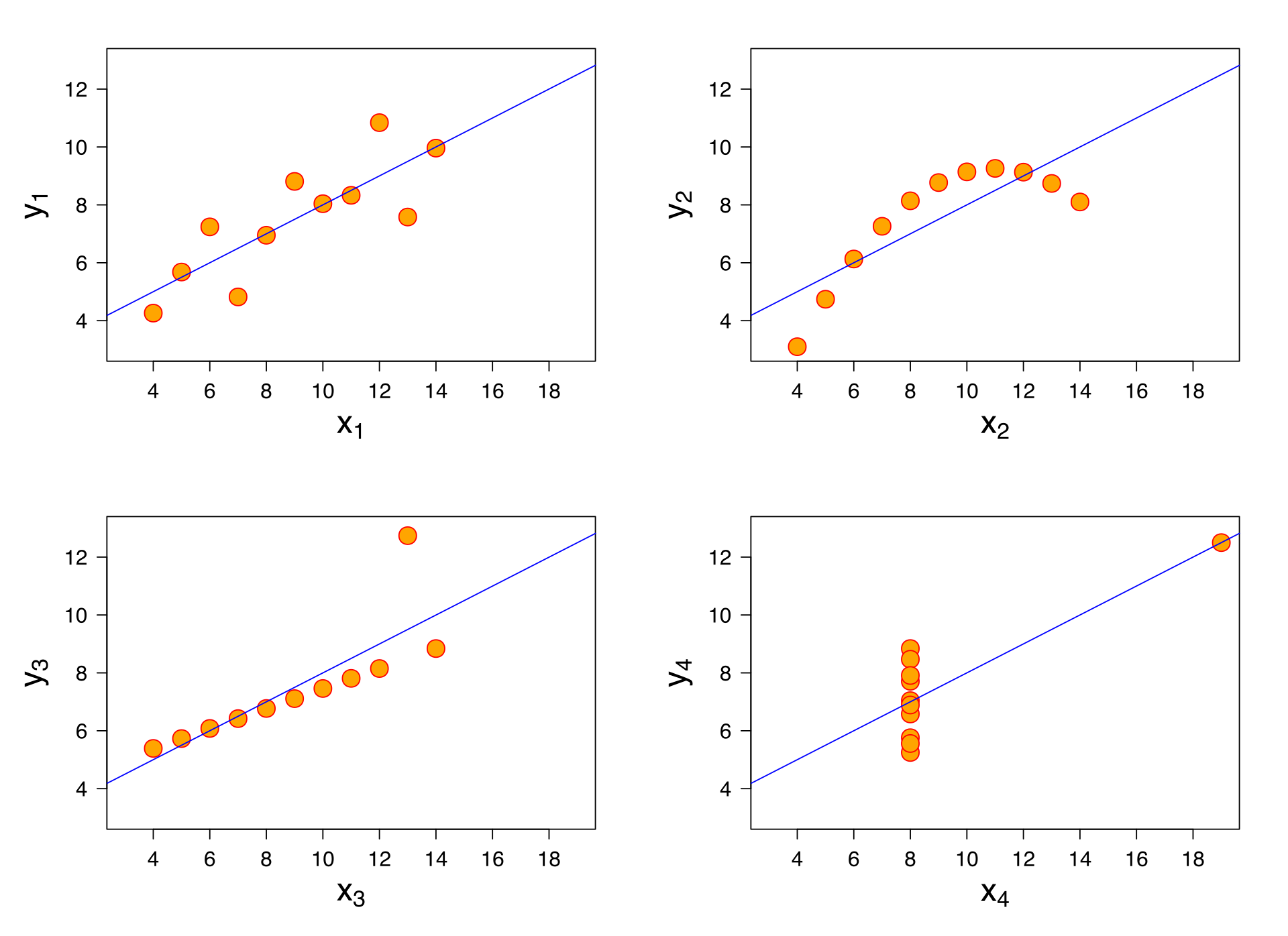
Among other things, scatterplots are critical for exploratory data analysis––for example, if you want to run a linear regression on your dataset, it is important to determine that the relationship you're investigating is linear (remember Anscombe's Quartet).
The pyplot package has a dedicated function for creating scatterplots as well, called scatter (documentation here).
An example call would look like this:
plt.scatter(
    x = [ ... ], # array of values for x-axis
    y = [ ... ], # array of values for y-axis
    c = [ ... ], # array of values to indicate color of points
    alpha = .7 # indicate shading/transparency of plot
)
What to ask our data?
Intuitively, we might want to know a few things:
- Do longer distances cost more?
- Do people tip more (either in amount or percentage terms) for longer distances?
- Does it cost more to travel more between boroughs, even holding the distance constant?
# Q: Do longer distances cost more?

plt.scatter(
    x = df_taxis['distance'],
    y = df_taxis['fare'],
    alpha = .6
)
plt.xlabel("Distance (miles)")
plt.ylabel("Fare ($)")
plt.title("Raw Fare by Distance Traveled")
plt.show()

Q: How could we ask about the relationship between distance and tip amount?
plt.scatter(
    x = df_taxis['distance'],
    y = df_taxis['tip'],
    alpha = .6
)
plt.xlabel("Distance (miles)")
plt.ylabel("Tip ($)")
plt.title("Tip Amount by Distance Traveled")
plt.show()

Q: What about distance and tip percentage?
plt.scatter(
    x = df_taxis['distance'],
    y = df_taxis['tip_pct'],
    alpha = .4
)
plt.xlabel("Distance (miles)")
plt.ylabel("Tip (%)")
plt.title("Tip Percentage by Distance Traveled")
plt.show()

Q: What about crossing between boroughs?
## Create a new variable
df_taxis['crossed_borough'] = df_taxis['pickup_borough'] != df_taxis['dropoff_borough']
df_taxis.head(1)
Plotting categorical and continuous data
Now, we want to add more information to our scatterplot––we have a categorical variable (crossed_borough), and we want the color (or perhaps shape) of each point to indicate the level of that variable, i.e., whether the trip crossed between boroughs.
cdict = {True: 'orange', False: 'blue'}
fig, ax = plt.subplots()
for group in set(df_taxis['crossed_borough']):
    df_tmp = df_taxis[df_taxis['crossed_borough']==group] # filter to appropriate group
    ax.scatter(
        x = df_tmp['distance'],
        y = df_tmp['fare'],
        label = group,
        c = cdict[group],
        alpha = .3
    )
plt.xlabel("Distance")
plt.ylabel("Fare ($)")
ax.legend(title = "Crossed Borough")
plt.show()

cdict = {True: 'orange', False: 'blue'}
fig, ax = plt.subplots()
for group in set(df_taxis['crossed_borough']):
    df_tmp = df_taxis[df_taxis['crossed_borough']==group] # filter to appropriate group
    ax.scatter(
        x = df_tmp['distance'],
        y = df_tmp['tip_pct'],
        label = group,
        c = cdict[group],
        alpha = .3
    )
plt.xlabel("Distance")
plt.ylabel("Tip (%)")
ax.legend(title = "Crossed Borough")
plt.show()

Barplots
Another commonly found type of plot is a barplot.
Typically, barplots feature:
- On the x-axis, a categorical (i.e., nominal) variable.
- On the y-axis, a continuous variable, usually summarized in some way (e.g., the means, with standard errors).
Barplots are effective for drawing attention to differences in the magnitude of some quantity across categories––though personally, I don't think they're always the most effective in terms of the amount of information conveyed per unit of space.
Barplots in pyplot
The corresponding pyplot function is bar. We saw this earlier, when we were trying to plot the counts of a categorical variable.
The basic inputs are as follows:
plt.bar(
    x = [ ... ], # array of categories
    height = [ ... ] # height of each category
)
Q: What is the mean tip % for green vs. yellow taxis?
Creating a new dataframe using groupby
Once again, groupby is very helpful here. We'll want to:
- Calculate the mean
tip_pctfor each level of thecolorvariable. - Plot this using
plt.bar.
df_color_tips_mean = df_taxis[['tip_pct', 'color']].groupby('color').mean().reset_index()
df_color_tips_mean
# Q: What's missing from this graph?

plt.bar(x = df_color_tips_mean['color'],
       height = df_color_tips_mean['tip_pct'])
plt.xlabel("Taxi Color")
plt.ylabel("Tip (%)")
plt.title("Tip (%) by Taxi Color")

Adding error bars
To add error bars, we can use plt.errorbar.
## First, calculate standard error of the mean
df_color_tips_sem = df_taxis[['tip_pct', 'color']].groupby('color').sem().reset_index()
df_color_tips_sem
plt.bar(x = df_color_tips_mean['color'],
        height = df_color_tips_mean['tip_pct'])

plt.errorbar(x = df_color_tips_mean['color'], ## as with bar, the x-axis is the *color*
             y = df_color_tips_mean['tip_pct'], ## as with bar, the y-axis is the *mean*
             yerr = df_color_tips_sem['tip_pct'] * 2, ## two standard errors, as typical
             ls = 'none', ## toggle this to connect or not connect the lines
             color = "black")

plt.xlabel("Taxi Color")
plt.ylabel("Tip (%)")
plt.title("Tip (%) by Taxi Color")

Other pyplot affordances
This short tutorial really only scratched the surface of what you can do with pyplot.
Just to give a sense:
- Add text to a plot with
pyplot.text - Create multiple subplots
- Create other types of plots, like boxplots or lineplots.
Part 2: Plotting with seaborn
In this section, we'll replicate some of those same plots from above, but now using seaborn.
As you'll see, seaborn offers an API that's (in most cases) cleaner and easier to use than pyplot, though there's a trade-off in terms of flexibility.
Histograms
Depending on your version of seaborn, you can plot a histogram using either:
seaborn.distplot: typically used for creating density plots, but can be adapted for histograms.seaborn.histplot: targeted more specifically at histograms.
sns.distplot(df_taxis['distance'], ## vector to plot
             kde = False, ## whether to use kernel density estimation to fit density curve
             norm_hist = False ## whether to norm histogram to display probability vs. counts
            )
plt.xlabel("Distance (miles)")
plt.ylabel("Count")
plt.title("Distribution of miles traveled")

Q: Exercise for home––recreate the rest of the histograms from Part 1 using seaborn.
Scatterplots
Fortunately, seaborn makes it much easier to create scatterplots, especially if you'd like to change the hue or style of the points.
sns.scatterplot(
    data = ..., # name of dataframe
    x = ..., # name of x-axis variable
    y = ..., # name of y-axis variable
    hue = ..., # name of hue variable
    style = ..., # name of style variable
    size = ..., # name of variable to modulate point size
)# Replicating our initial plot: Do longer distances cost more?
sns.scatterplot(data = df_taxis,
x = "distance",
y = "fare",
alpha = .7)
plt.xlabel("Distance (miles)")
plt.ylabel("Fare ($)")
plt.title("Raw Fare by Distance Traveled")
plt.show()

Q: How would you create the same plot, but with the points colored to reflect whether a borough has been crossed?
# Replicating our initial plot: Do longer distances cost more?

sns.scatterplot(data = df_taxis,
                x = "distance",
                y = "fare",
                hue = "crossed_borough",
                alpha = .7)
plt.xlabel("Distance (miles)")
plt.ylabel("Fare ($)")
plt.title("Raw Fare by Distance Traveled")
plt.show()

Q: Exercise for home––recreate the other scatterplots, or new ones, using seaborn.
Bar plots
Finally, we can reconstruct some of the bar plots we created above, using the barplot function.
sns.barplot(
    data = ..., # name of dataframe
    x = ..., # name of x-axis variable (categorical)
    y = ..., # name of y-axis variable (continuous)
    hue = ..., # name of hue variable
    ci = float # size of confidence intervals to draw (these are estimated using *bootstrapping*, not SEM)
)
Q: How would we recreate the figure showing average tip % by taxi color?
sns.barplot(data = df_taxis,
            x = "color",
            y = "tip_pct",
            ci = 95
           )

plt.xlabel("Color")
plt.ylabel("Tip (%)")
plt.title("Tip (%) by Taxi Color")

Q: What other variables would you be interested in looking at? Whether or not they're crossed a borough?
## Same as above, but with hues corresponding to pickup borough
sns.barplot(data = df_taxis,
            x = "color",
            y = "tip_pct",
            hue = "crossed_borough",
            ci = 95
           )

plt.xlabel("Color")
plt.ylabel("Tip (%)")
plt.legend(title = "Crossed Borough")

Additional exercises with taxis
This dataset is quite rich, and you could ask a number of other questions.
Just to get you started:
- Does
distancetraveled vary as a function of the hour of pickup? - Is the
tip_pctlarger as a function of the hour of pickup? - How does
distancerelate to the amount of time betweenpickupanddropoff? - Do customers tip more when the trip takes longer (controlling for
distance)?
Part 3: Reconstructing plots from "the wild"
Data visualizations are increasingly common in blog posts, news articles, or even social media.
Reconstructing a visualization you find "in the wild" can reveal some of the hidden complexities of this process.
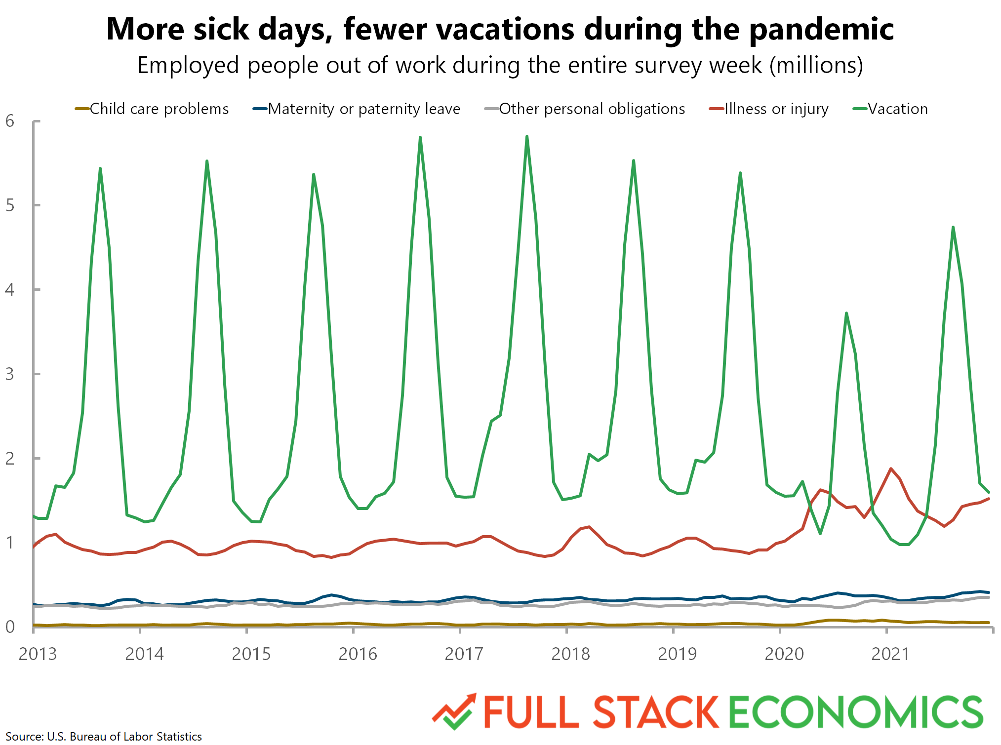
To that end, I reached out to Timothy Lee, author of a very interesting blog post found on Full Stack Economics, entitled "18 charts that explain the American economy". He was kind enough to give me the data he used to construct two of the charts included in that post: chart #7 and chart #14.
In this reconstruction, let's focus on Chart 14.
Chart 14: Reasons for missing work
This chart depicts the relative magnitudes of different causes for missing work, over time. For me, there are a couple takeaways:
- Vacation time is highly seasonal, peaking each summer and creating an almost oscillatory pattern.
- Starting with 2020, vacation time drops a bit (though preserves the seasonal pattern), and we see a rise in missed work due to illness.
Let's try to reconstruct the chart from scratch!
Just for reference, the chart looks like this:
Load the data
First, we load and inspect the data. Here, we have to actually read in a .csv file using pandas.read_csv.
Question: What do you you all notice about the way this dataframe is structured?
df_missing = pd.read_csv("data/missing_work.csv")
len(df_missing)
# Inspecting the dataset
df_missing.head(5)
## Note: this is just one of the many approaches!

df_missing_long = pd.melt(df_missing, # dataframe
                          value_vars=['Child care problems', # which columns to stack into long format
                                      'Maternity or paternity leave',# which columns to stack into long format
                                      'Other family or personal obligations', # which columns to stack into long format
                                      'Illness or injury', # which columns to stack into long format
                                      'Vacation'], # which columns to stack into long format
                          id_vars=["Year", "Month"], # which columns to group/id them by
                          var_name = "Cause", # what to call the new grouping column
                          value_name = "Days" # what to call the new value column
                         )
df_missing_long.head(5)
# Note: One other thing––the original graph aggregated data by the *millions*.
# This is already in the *thousands*, so we'll divide by another 1000 to match the origina.
df_missing_long['Days_millions'] = df_missing_long['Days']/1000
Distribution over the year
Before we try to reconstruct the plot, let's first look at the distribution of missed days across years, to see if we can detect any patterns.
Q: What pattern should we conclude?
sns.lineplot(data = df_missing_long,
             x = 'Month',
             y = 'Days_millions',
             alpha = .7)

plt.xlabel("Month")
plt.ylabel("Days (Millions)")

Q (2): Why is there so much error in the summer months?
# This shows us that it's *vacation* specifically that has a seasonal pattern
sns.lineplot(data = df_missing_long,
             x = 'Month',
             y = 'Days',
             hue = 'Cause',
             alpha = .7)

# This makes sure the legend doesn't cover up the plot itself
plt.legend(bbox_to_anchor=(1.02, 1), loc='upper left', borderaxespad=0)
plt.xlabel("Month")
plt.ylabel("Days (Millions)")

Reconstructing the original plot
Now, rather than averaging across years to get a picture of the "average year", let's just look at this over time.
One issue is that we'll first need to convert each observation (a Month and a Year) into a datetime object, so we can plug this into pandas and seaborn native datetime operations.
## First, let's concatenate each month and year into a single string
df_missing_long['date'] = df_missing_long.apply(lambda row: str(row['Month']) + '-' + str(row['Year']), axis = 1)
df_missing_long.head(5)
## Now, let's create a new "datetime" column using the `pd.to_datetime` function
df_missing_long['datetime'] = pd.to_datetime(df_missing_long['date'])
df_missing_long.head(5)
Q: Now, how can we actually create the final plot?
sns.lineplot(data = df_missing_long,
             x = 'datetime',
             y = 'Days_millions',
             hue = 'Cause')

plt.legend(bbox_to_anchor=(1.02, 1), loc='upper left', borderaxespad=0)
plt.xlabel("Year")
plt.ylabel("Days (Millions)")
plt.title("Reasons for missing work")

Bonus: Smoothing
If you look at the original plot carefully, you'll see that the observations have been smoothed using a rolling window average.
Fortunately, we can do the same thing using the pandas.rolling function.
## Construct a 3-month rolling average to "smooth" the data
df_missing_long['Days_rolling_avg'] = df_missing_long['Days_millions'].rolling(3).mean()
sns.lineplot(data = df_missing_long,
             x = 'datetime',
             y = 'Days_rolling_avg',
             hue = 'Cause')

plt.legend(bbox_to_anchor=(1.02, 1), loc='upper left', borderaxespad=0)
plt.xlabel("Year")
plt.ylabel("Days (Millions)")
plt.title("Reasons for missing work (smoothed)")

## Discussion: Should we limit y-axis/causes to investigate trends in other causes, like child care problems?
## Q: How could we do this?
sns.lineplot(data = df_missing_long,
            x = 'datetime',
            y = 'Days_millions',
            hue = 'Cause',
            alpha = .5)

# An easy way to do this is just limit the extent of the y-axis
plt.ylim(0, .5)

plt.legend(bbox_to_anchor=(1.02, 1), loc='upper left', borderaxespad=0)
plt.xlabel("Year")
plt.ylabel("Days (Millions)")
plt.title("Reasons for missing work")

Conclusion
This concludes the tutorial! Hopefully, this has equipped you with some of the tools necessary to:
- Describe the benefits and advantages of data visualization.
- Propose a suitable data visualization for a particular dataset and question.
- Implement a first-draft of this visualization in Python, using either
matplotliborseaborn. - Evaluate this data visualization and make suggestions for improvements in future iterations.
- Reconstruct a visualization found "in the wild" using the appropriate dataset.
If you're interested in R, a tutorial on data visualization in R can be found here.
Part 4 (Bonus): Anscombe's Quartet
As discussed in the slides, one key motivation for making data visualizations is exploratory data analysis (EDA). Among other things, EDA can be used to ensure that the assumptions of a statistical test are met (e.g., that a relationship in our data is linear, if one is running linear regression).
Load data
df_anscombe = sns.load_dataset("anscombe")
df_anscombe.head(5)
Calculate correlation coefficient for each dataset
Just to make sure the central claim is correct, let's calculate Pearson's r for each dataset. Is it roughly the same in each?
from scipy.stats import pearsonr

corrs = []
for dataset in set(df_anscombe['dataset']):
    df_tmp = df_anscombe[df_anscombe['dataset']==dataset]
    r = round(pearsonr(df_tmp['x'], df_tmp['y'])[0], 4)
    corrs.append({
        'r': r,
        'dataset': dataset
    })

df_corrs = pd.DataFrame(corrs)
df_corrs
Plot the data: a first (and flawed) approach
First, I'm going to plot the data just using seaborn.scatterplot.
# Q: What's wrong with this approach?

sns.scatterplot(data = df_anscombe,
                x = 'x',
                y = 'y')

plt.xlabel("X")
plt.ylabel("Y")

Plot the data using FacetGrid
The above plot lumps all the datasets together into the same plot. But we want to visualize them all separately.
For this, we can rely on FacetGrid.
Introducing FacetGrid
The FacetGrid object allows you to map a particular plot aesthetic (i.e., a particular x/y axis choice) onto multiple subplots, broken up by the levels of a categorical variable.
For example, you could create different subplots for payment type (cash vs. credit card), each showing the same relationship between distance and fare.
g = sns.FacetGrid(df_anscombe, col="dataset")
g.map(sns.scatterplot, "x", "y")

Plot the data using lmplot
Another approach that allows us to facet the data is to use lmplot.
The benefit of lmplot is that it will also plot a regression line over our data, which, in this case, clearly demonstrates that across each dataset, the estimated slope is roughly the same.
sns.lmplot(data = df_anscombe,
           x = 'x',
           y = 'y',
           col = 'dataset')

Conclusion
This concludes the tutorial! Hopefully, this has equipped you with some of the tools necessary to:
- Describe the benefits and advantages of data visualization.
- Propose a suitable data visualization for a particular dataset and question.
- Implement a first-draft of this visualization in Python, using either
matplotliborseaborn. - Evaluate this data visualization and make suggestions for improvements in future iterations.
- Reconstruct a visualization found "in the wild" using the appropriate dataset.
If you're interested in R, a tutorial on data visualization in R can be found here.