Graphical excellence is the well-designed presentation of interesting data—a matter of substance, of statistics, and of design … [It] consists of complex ideas communicated with clarity, precision, and efficiency. … [It] is that which gives to the viewer the greatest number of ideas in the shortest time with the least ink in the smallest space … [It] is nearly always multivariate … And graphical excellence requires telling the truth about the data. (Tufte, 1983, p. 51).
Some principles:
Use your ink wisely.
Be true to the data.
Consider the visual logic of the figure.
Order matters.
Keep scales consistent.
Principle 1: Use your ink wisely
Every element in your visualization should serve a purpose.
Remove “chart junk”: unnecessary gridlines, borders, 3D effects, decorations.
Maximize your data-ink ratio: the proportion of ink used to display actual data.
Tufte’s principle
“Above all else show the data.” - Edward Tufte
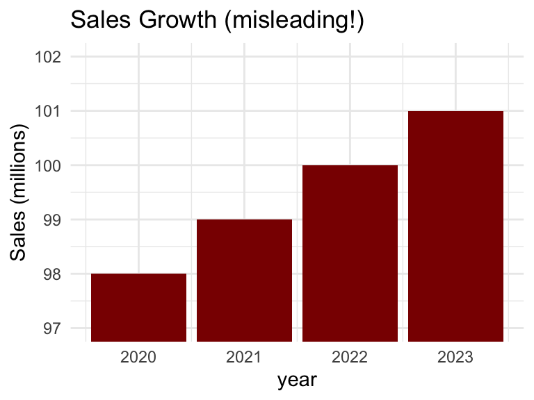
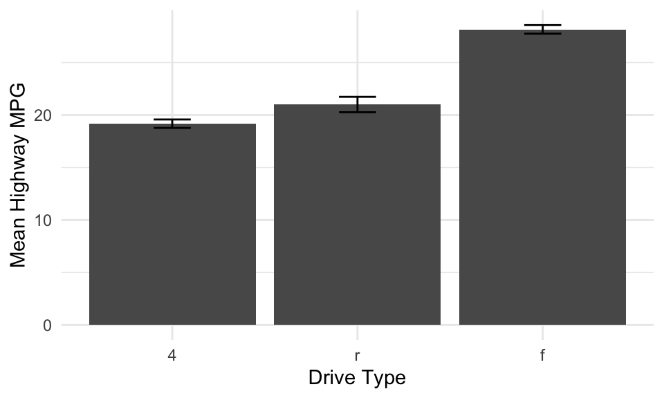
Principle 2: Be true to the data
Don’t manipulate scales to exaggerate or hide effects.
Include zero baseline for bar charts (unless there’s good reason not to).
Avoid cherry-picking data or timeframes.
Represent uncertainty when appropriate (e.g., error bars, confidence intervals).
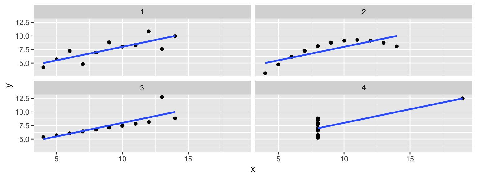
Principle 3: Consider the visual logic
Position is probably easiest to judge accurately.
Angle and area are harder (e.g., pie charts).
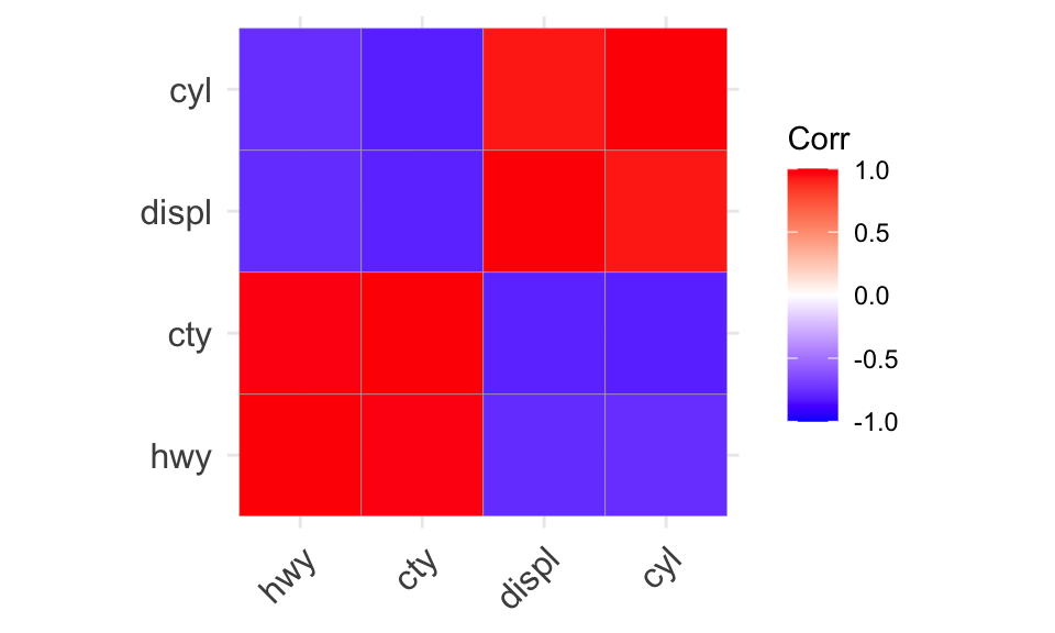
Color hue can work for categorical data.
Use distinctive and meaningful colors!
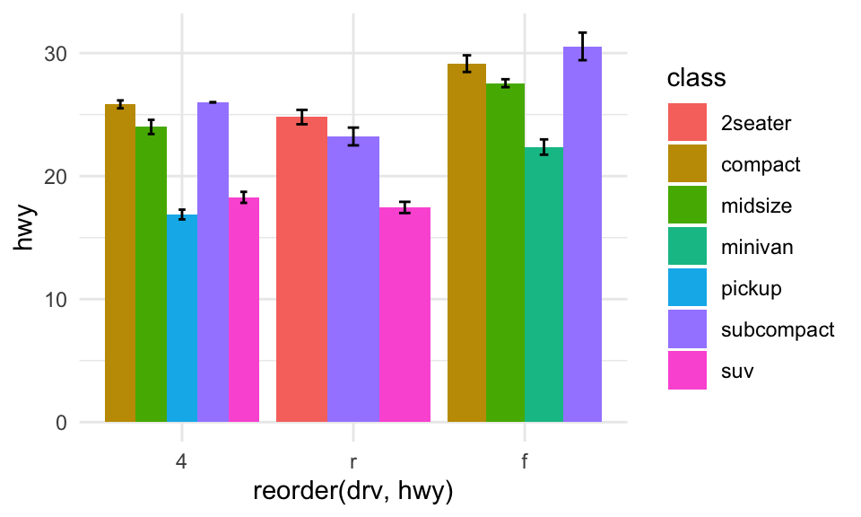
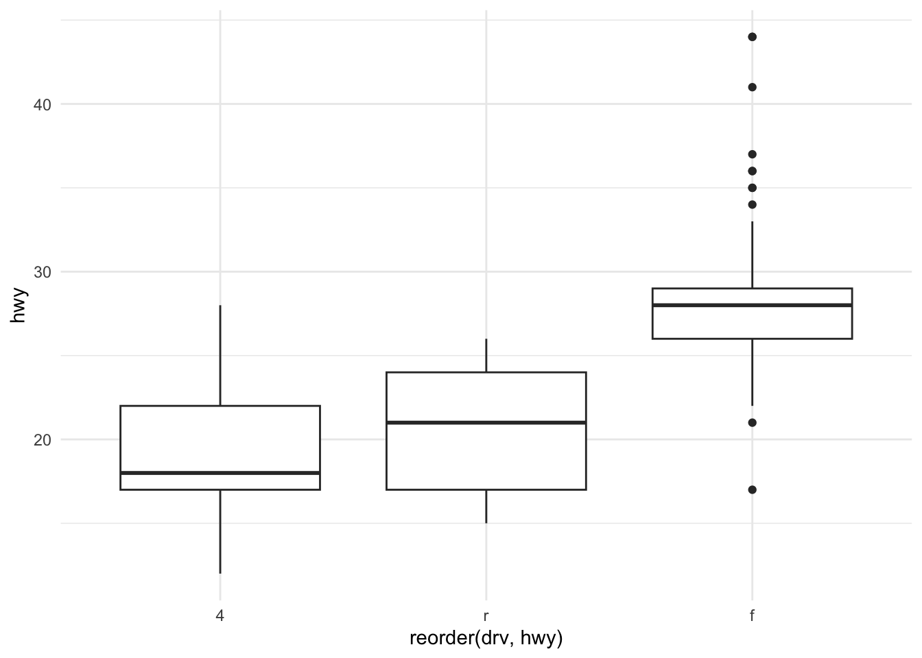
Stacked bar plots often hard to interpret!
Tip
This will be relevant when thinking about the layers in ggplot.
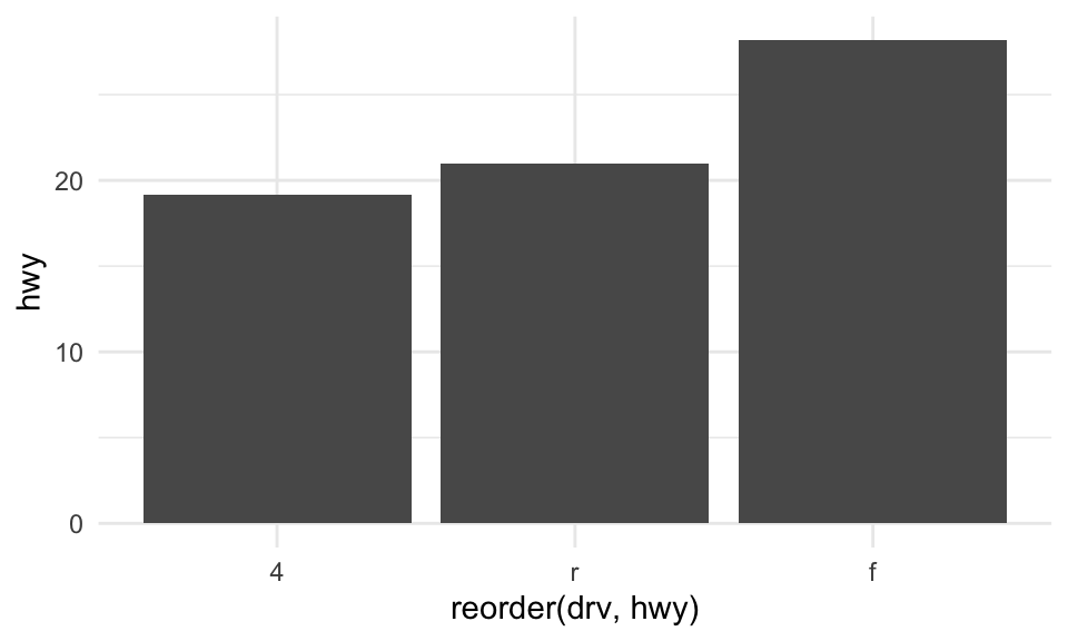
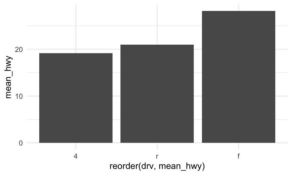
Principle 4: Order matters
For categorical data: order by frequency or a meaningful sequence.
For ordinal data: maintain the natural order (e.g., Strongly Disagree → Strongly Agree).
For time series: always order chronologically.
Principle 5: Keep scales consistent
Use the same axis ranges for meaningful comparison.
In faceted plots, decide: fixed scales (scales = “fixed”) or free scales (scales = “free”)?
Free scales can be misleading but useful when ranges differ greatly.
Rule of thumb
Use consistent scales when inviting direct comparison; use free scales when showing patterns within each group.
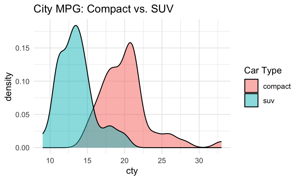
One benefit of a density plot is that it’s easier to overlay multiple distributions on the same plot. The alpha parameter controls the opacity of each distribution.
mpg %>%filter(class %in%c("compact", "suv")) %>%ggplot(aes(x = cty, fill = class)) +geom_density(alpha = .5) +labs(title ="City MPG: Compact vs. SUV", fill ="Car Type") +theme_minimal()
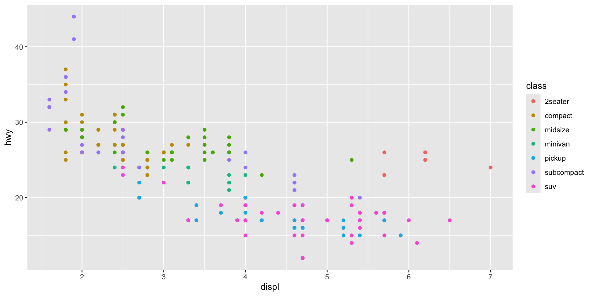
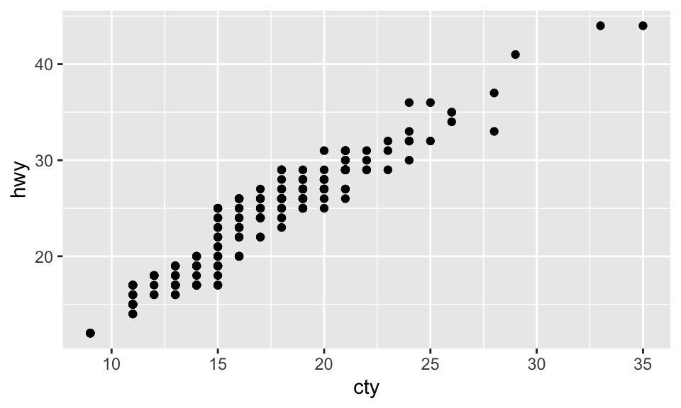
Scatterplots
A scatterplot shows the relationship between two continuous variables, where each point represents an observation.
A scatterplot can be created with geom_point.
mpg %>%ggplot(aes(x = cty, y = hwy)) +geom_point()
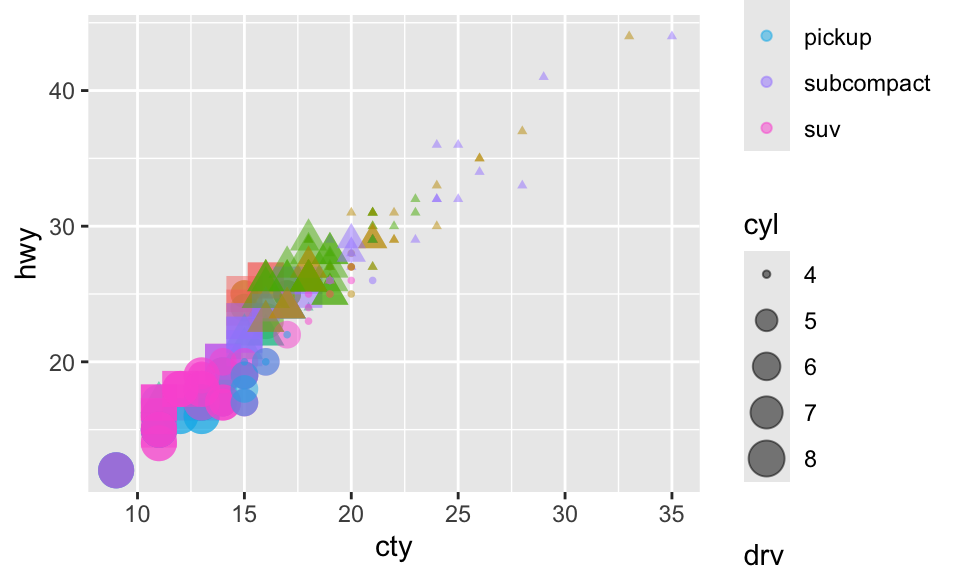
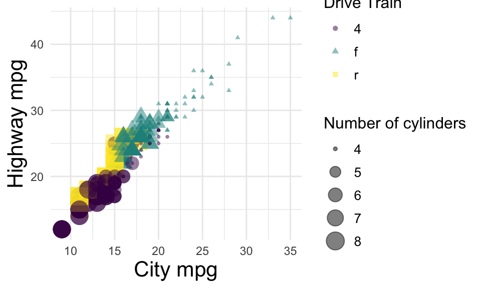
Adding layers to a scatterplot
We can further modify the color, size, and shape of individual dots.
mpg %>%ggplot(aes(x = cty, y = hwy, color = class, size = cyl, shape = drv)) +geom_point(alpha = .5)
Tip
Use categorical variables for shape, categorical or continuous variables for color, and ordinal or continuous variables for size.
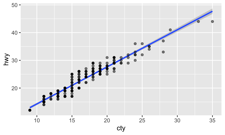
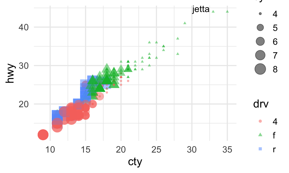
Plotting a regression line
We can also use geom_smooth to plot a regression line (or another non-linear function) over our scatterplot.
(If there are multiple colors, etc., a different line will be plotted for each color.)